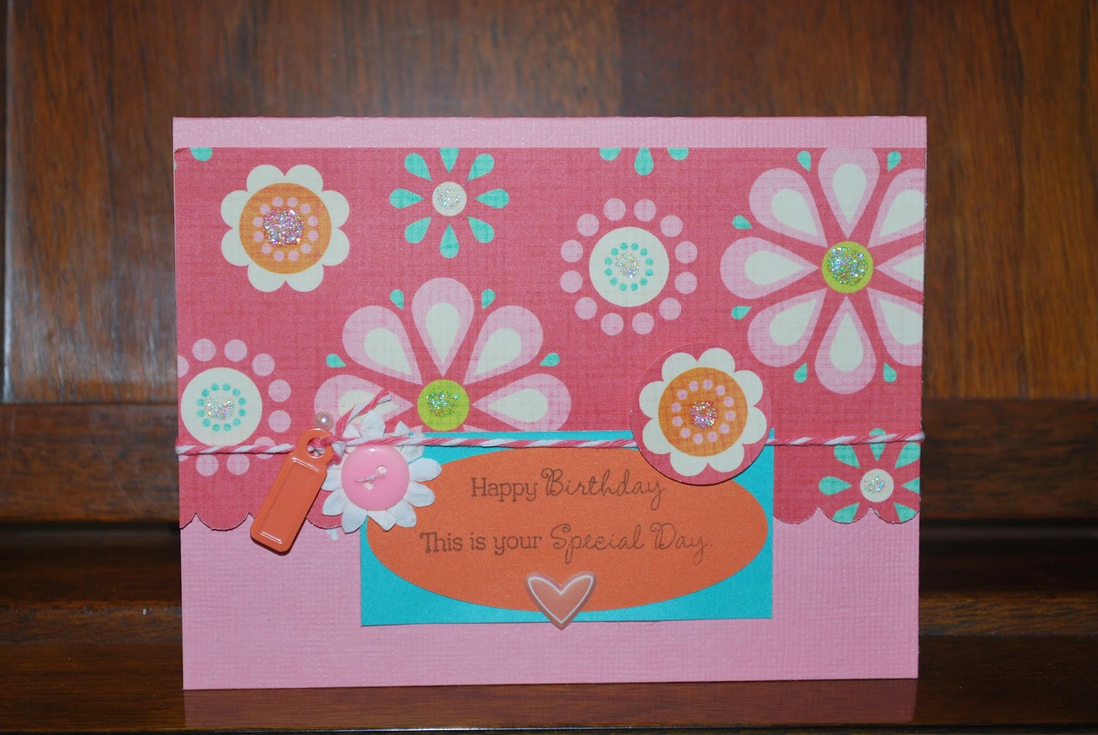
This is a very basic card but points out a design principle that works.
When you take three colors plus a neutral there is a balance that feels right visually.
Here the pinks and oranges aren't all the exact same, but because they're in the same color family they feel harmonious. Adding the blue, which is a contrasting color to the orange, and is a brighter hue, also tends to balance the oranges and pinks which are side by side on the color wheel.
Think of it like a stool - three keeps it in balance. The touch of off-white could have been much larger. I could have used that for the paler pink background, but instead I kept the neutral as a small part. Using neutrals is a matter of preference but because they don't compete with the colors, they also feel in balance.
Just something to think about when you're making cards.
No comments:
Post a Comment